Hi everyone!
It has been a while since I posted on this site.
I had some news I want to share with you. First of all, I am posting Karate Dottie chapters every Tuesday at the new www.karatedottie.com. Initially, I will be serializing her first book, Karate Dottie and the Treacherous Treehouse in it's entirety with additional artwork and then I will roll right into the unpublished sequel Karate Dottie and the Alien Menace. The sequel will not be available for purchase in book form until it is serialized in it's entirety online. To start at the beginning of the adventure, just click here.
Why? Because this year is the 5th anniversary of the publication of Karate Dottie and the Treacherous Treehouse (2009) which also launched Metal Lunchbox Publishing which now has 7 titles by authors Ellen Parry Lewis, Charles Matthews and Janine Carbone.
Karate Dottie is a determined and fierce little girl who dreams of growing up to be a samurai warrior much to the dismay of her parents and the amusement of her classmates. She is fierce and scrappy and will not let anything stand in her way, even her asthma. Her best friend is the portly big hearted Gordo who always gets in trouble because of Dottie’s wild and outlandish schemes. In her first adventure, one of Dottie’s classmates suffers the loss of a beloved pet in a tragic accident. While attending the funeral, Dottie comes up with a misguided plan for her and Gordo to reunite Fluffy with her owner. Things do not go exactly as planned and the unintended consequences are chilling.
Please check it out and leave a comment. I love getting your feedback. Feel free to contact me directly at sfvarney@metallunchboxpublishing.com If you know someone you feel would enjoy the stories, please let them know as well.
All the best!
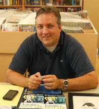
SF (Sam) Varney
Thursday, June 19, 2014
Thursday, November 18, 2010
Future Vision and Metal Lunchbox

Thought I would post a couple of new designs. The first is for Metal Lunchbox Publishing. I grew up in the 70's and one of my favorite things to do at the beginning of the school year was to pick out a new lunchbox. Some of my favorites were Space 1999, Star Wars and Scooby Doo. I wish I had kept them but truthfully they were pretty beat up by the end of the year. Metal Lunchbox Publishing specializes in children and young adult books so I wanted to go for a fun retro look.

Since Halloween was around the corner, I decided to put together a version with a different color scheme. Halloween is such a fun holiday and I like the contrast of the color scheme on this version. It almost looks like it glows in the dark. I like the idea about having different color schemes at different times of the year so I may play around with the color design and elements in the future.
I also completed another book cover with Future Vision by Ellen Parry Lewis and published by Metal Lunchbox Publishing. Future Vision is about Samantha Bell who is an ambitious high school student with a bright future until one fateful night at the local fair. She decides to go through the controversial Future Vision exhibit. This attraction allows viewers to see up
 to twenty seconds of their personal future. Because of the possible risks, viewers must ingest a dissolvable pill immediately afterward, causing them to forget what they had just witnessed. Samantha tries to take the future into her own hands, though, when she smuggles a pen inside the attraction. Although she was forced to forget what she had seen, she leaves the attraction with an ominous feeling and three mysterious words written on her hand: Snow, fight, and ca. Samantha feels she must figure out what those three words mean before the event occurs and possibly ruins her life.
I created this image in Photoshop with my Wacom tablet. I decided to focus on the imagery of a ferris wheel at night (it was a lot more dramatic than having the words written on her hand or a few other ideas I played around with). I put dark clouds in the background to give it a more ominous look. And since the future is uncertain, I made the "Future" blurry or unclear.
Comments are welcome.
Monday, August 30, 2010
September Book Signings
I will be signing copies of Karate Dottie and the Treacherous Treehouse at the Sharpsburg Public Library on Saturday September 18th from 10:30am to 12:30pm as part of the Sharpsburg Heritage Days festival in Sharpsburg, Maryland. I will be joined by Charles Matthews, the talented author who wrote Pinesport Divide.
I am also scheduled for a book signing at the Bizarre Bazaar on Saturday September 25th at Victory Comics in Falls Church, Virginia. If you are in the area, be sure to stop by and say hello.
Sunday, August 1, 2010
Project Redstar and Geppi Museum

Just wanted to share what is currently on my desk. Here is a book cover for Project Redstar, a variant cover for Pinesport Divide by Charles Matthews.
I played around quite a bit with creating
patterns on the background. I got my inspiration from a ceramic and carbon fiber wedding band which you can see here. The picture of the wedding band really doesn't do it justice but if you look at it in a store, it have a really cool 3D effect.
I kept playing around with different sizes and I finally settled down with this size. I probably could have gone a little bigger for the individual blocks but I was concerned about legibility.

To create the background, I made a block of 12x12 pixels in Adobe Photoshop and then divided it in half. I then utilized the gradient tool to create a gradient black to white from top to bottom. On the other half of the block, I pulled the gradient in the opposite direction. I then saved it as a pattern. I created a fill layer in my book cover file and selected my custom pattern to create the effect. Creating another layer, I pulled two gradients from the sides to give it more of a three dimensional look.
This blog is not intended as a step by step instructional but if you have any questions about a specific technique, please do not hesitate to send me a note.
I recently had an opportunity to take a few days off and go visit some of the local museums in the area. One of the benefits of living in Maryland is the wide variety of incredible art museums in Washington DC and Baltimore. My older sons wanted to go see the Freer Gallery of Art and the Hirshhorn Gallery, both part of the Smithsonian collection of museums in the National Mall in Washington DC. At the Hirshhorn, I was very impressed with the body of work by Yves Klein.
In Baltimore, fans of comics books, strips and popular culture should visit the Geppi Museum. Conveniently located at Camden Yards, this is a great museum for all ages and recently was nominated for the Nickelodeon Parents Pick Award for best museum. Not only does it have a fantastic collection of original artwork and comics, but chances are you will get a chance to see some of the toys you grew up with no matter what age you are. My five year old son was a big fan of the toys and metal lunchboxes. We had a great time and look forward to going back.


Sunday, July 18, 2010
Inks and Carrots
 Here is the inked version of Leara. Changed the angle a bit. Inked with india ink and a brush. Cleaned up with Photoshop. For ink, I prefer Higgins Black Magic with a little bit of Koh I Noor rapidograph ink mixed in. If I use Black Magic straight, it tends to start get too thick for some of the finer liner work.
 I always had a fascination with finding out what tools of the trade some of my favorite artist used to get their effects (especially inkers). It was almost as if finding the right tool would instantly improve my artwork. In college, I once had an instructor who wanted to make a point that it was about the artist and not about the tools so she had us paint with carrots. Initially I thought it was a stupid idea but it turned out to be a great exercise. There were all kinds of different solutions including using the leafy part of the carrot to paint like a brush or carving it into different types of pens using an x acto knife. It was a lot of fun and proved a point. We were able to create some very interesting textures that would not have been created by traditional means. Point was made.
That being said, having good materials matter and there is nothing worse than trying to ink with a cheap brush. I prefer Raphael series 8404 Kolinsky sable #2 for inking but there are lots of great brushes out there. You never know, you might find your favorite in the produce aisle.
Monday, June 28, 2010
Pinesport Divide Variant

I am working on a variant cover for Pinesport Divide, a great book by Charles Matthews. Here is the pencil layout for Leara. Next up traditional inks with a brush and then color in Photoshop.
Thursday, June 17, 2010
Karate Dottie and the Alien Menace Color
 Here is the colored version. Traditional line drawing with india ink on bristol board and colored with Photoshop. Still playing around with background color. May have to change things up a little if I use this image on the cover. Interior artwork will all be black and white. This is from the upcoming book Karate Dottie and the Alien Menace
Subscribe to:
Posts (Atom)