Here is the trailer for Karate Dottie and the Treacherous Treehouse. Pinesport Divide by Charles Matthews is currently in the proofing stage and should be available for sale soon. Currently working on Karate Dottie and the Alien Menace and a reboot of the Spirit House webcomic.
Wednesday, February 24, 2010
Monday, February 1, 2010
Pinesport Divide Book Cover
Thought I would share my process for creating the book cover design for the new book coming out called Pinesport Divide by Charles Matthews (Metal Lunchbox Publishing). It is a young adult book about a young boy dealing with conflicting emotions of loyalty to his best friend and his romantic feelings towards his best friend's girl. When it becomes evident that his best friend is involved in a dangerous new program that physically enhances human beings and threatens to embroil the world in a new civil war, he is forced to make a painful decision in an attempt to save lives and avert a war.
The first step in this process was to come up with a logo for the book. As usual, many different versions of the logo. Most ended up in the trash as first drafts often do but I eventually narrowed it down to a few versions for my client to choose from. At the presentation of the rough drafts, the client liked one design in particular which I developed. Since this was set in part at a high school and there are some critical scenes involving sports, I went for a varsity look.

Next came the development of the cover. Initially, the direction was to do an illustration of the title character as the cover. He was to be a little battered (he goes through some abuse in the book) and one of his eyes glows in the dark. I like to put together a few different options for the client so I presented three versions of the book cover.

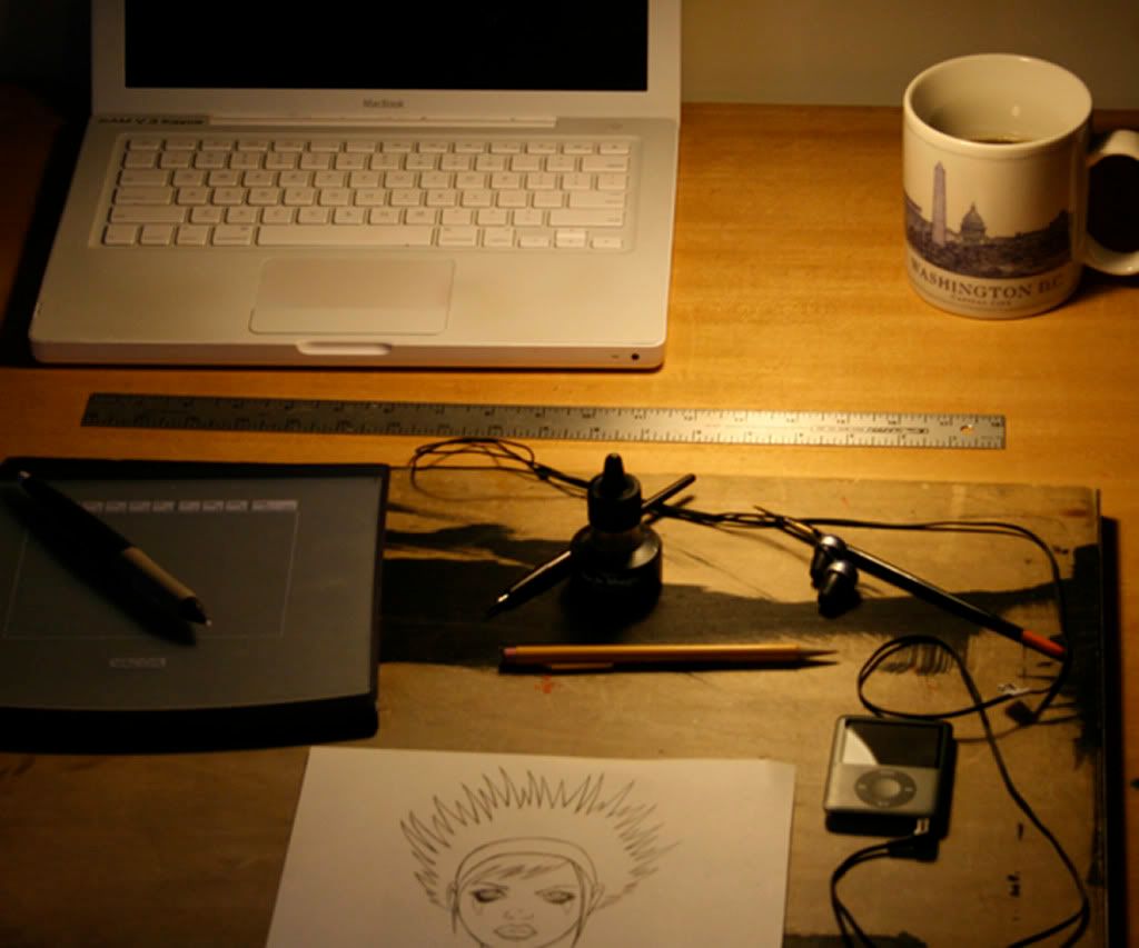
The illustration was completed entirely in Photoshop using a Wacom tablet. Part of the problem with this illustration is the glowing eye reveals a fairly major plot point in the story.

This version was more of a graphic design/typography approach to the assignment. I like the way that it looks a little bit like a journal from a distance.

I had some concerns about the legibility of the original logo design especially when shrunken down to the thumbnail preview size you see on websites such as Amazon and this version improves it. The little guy at the bottom was inspired in part by the highly stylized animated credit sequence at the end of The Incredibles (which I just introduced to my two youngest boys).
These were the three designs presented to the client. The client liked the third version the best but did not care for the highly stylized little dude at the bottom and wanted a more realistic representation of our tormented main character. The other request was to change the size of the "S" in Pinesport so people would not mistake it for Pine Sport. The final version of the book cover is below.

In case you wanted to watch me create this final version and had some time on your hands, below is a video screen capture of my desktop. The book should be published soon and I will leave an update with all the details. Comments are always welcome.
The first step in this process was to come up with a logo for the book. As usual, many different versions of the logo. Most ended up in the trash as first drafts often do but I eventually narrowed it down to a few versions for my client to choose from. At the presentation of the rough drafts, the client liked one design in particular which I developed. Since this was set in part at a high school and there are some critical scenes involving sports, I went for a varsity look.

Next came the development of the cover. Initially, the direction was to do an illustration of the title character as the cover. He was to be a little battered (he goes through some abuse in the book) and one of his eyes glows in the dark. I like to put together a few different options for the client so I presented three versions of the book cover.

The illustration was completed entirely in Photoshop using a Wacom tablet. Part of the problem with this illustration is the glowing eye reveals a fairly major plot point in the story.

This version was more of a graphic design/typography approach to the assignment. I like the way that it looks a little bit like a journal from a distance.

I had some concerns about the legibility of the original logo design especially when shrunken down to the thumbnail preview size you see on websites such as Amazon and this version improves it. The little guy at the bottom was inspired in part by the highly stylized animated credit sequence at the end of The Incredibles (which I just introduced to my two youngest boys).
These were the three designs presented to the client. The client liked the third version the best but did not care for the highly stylized little dude at the bottom and wanted a more realistic representation of our tormented main character. The other request was to change the size of the "S" in Pinesport so people would not mistake it for Pine Sport. The final version of the book cover is below.

In case you wanted to watch me create this final version and had some time on your hands, below is a video screen capture of my desktop. The book should be published soon and I will leave an update with all the details. Comments are always welcome.
Watch live streaming video from sfvarney at livestream.com
Subscribe to:
Comments (Atom)


